Theme Customization
The appearance of Onsen UI is defined by CSS Components. When using Onsen UI the following CSS reference, which contains the CSS Components themselves, needs to be specified.
<link rel="stylesheet" type="text/css" href="path/to/onsen-css-components.css">
Onsen UI default style can be modified by customizing the CSS Components themselves. Onsen UI CSS Components are not written in CSS based meta-language like Sass or Less, but are based on cssnext, which incorporates the latest standard CSS syntax. By understanding its working principles, anyone can freely customize Onsen UI’s appearance.
This guide provides all the information required to customize Onsen UI CSS Components.
Setup
The CSS source code is specified in multiple stylesheets. All these files can be built into a single CSS file (onsen-css-components.css). In order to do so, an initial setup operation needs to be performed.
First, use npm to install Onsen UI package in a chosen directory. If the directory does not have an npm package file (package.json), run npm init to create a default one.
$ npm init # if package.json is missing
Then install onsenui package. You can either install the latest version or a specific one, based on your needs.
$ npm install onsenui

$ npm install onsenui@2.7.0 # install a specific version
The onsenui package will be installed in the node_modules directory and css-components-src directory is inside the onsenui package itself. Navigate to it.
$ cd node_modules/onsenui/css-components-src
At this point, install the package dependencies by using yarn. If you do not have it installed yet, check yarn installation instructions.
$ yarn install --pure-lockfile
Once the dependencies have been successfully installed, run the following command to execute the previewer.
$ yarn run serve

$ npm run serve # alternative command
If you are using an Onsen UI version prior to 2.7.0, run gulp serve instead of yarn run serve.
$ npm install -g gulp

$ gulp serve
The build execution will generate an output similar to the following one:
...
[15:37:02] Finished 'build' after 5.25 s
[15:37:02] Starting 'serve'...

Access URLs:
     Local: http://localhost:4321/
  External: http://(IP Address):4321/

Built CSS Files:
  ./build/onsen-css-components.css
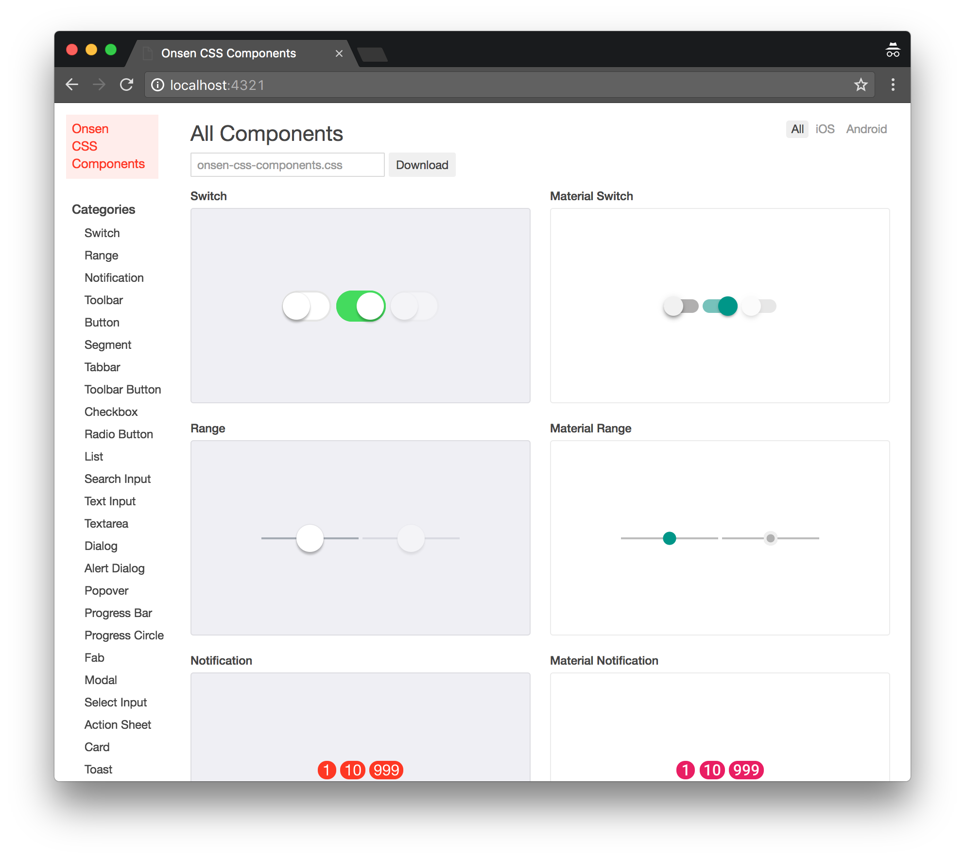
When http://localhost:4321/ is opened in a Web Browser, a preview of the CSS Components will be displayed.
To see the preview on a mobile device, connect the device to the same network of your PC and open http://(IP Address):4321/ on its Web Browser.
If you just want to build the CSS Components once, instead of starting the previewer, run the following command:
$ yarn run build

$ npm run build #alternative command
Customize
If a CSS file is modified while yarn run serve command is running, it will be automatically built and the changes will be reflected on the previewer. During the customization process, each CSS Components file needs to be modified individually, while continuously monitoring the state of the changes.
css-components-src directory is structured as it follows:
css-components
├── build
├── misc
├── node_modules
├── previewer-src
└── src
    ├── components
    └── img
src/components directory contains the CSS files that make up Onsen UI CSS Components.
With the previewer in execution, let’s try to edit the Switch Component CSS file (src/components/switch.css). yarn run serve execution will display a message similar to the following one, while the CSS will be automatically built and displayed in the previewer.
[17:07:44] Starting 'css-clean'...
[17:07:44] Finished 'css-clean' after 7.94 ms
[17:07:44] Starting 'stylelint'...
[17:07:45] Finished 'stylelint' after 1.33 s
[17:07:45] Starting 'cssnext'...
[17:07:45] Finished 'cssnext' after 257 ms
[17:07:45] Starting 'cssmin'...
[17:07:46] Finished 'cssmin' after 453 ms
[17:07:46] Starting 'build-css'...
[17:07:46] Finished 'build-css' after 8.11 μs
[17:07:46] Starting 'generate-preview'...
[17:07:46] Finished 'generate-preview' after 156 ms

Access URLs:
     Local: http://localhost:4321/
  External: http://192.168.100.100:4321/

Built CSS Files:
  ./build/onsen-css-components.css
If the CSS syntax is incorrect, a relative error will appear on the command line.
In case you need to use a customized CSS Component on your own project, you can just copy ./build/onsen-css-components.css file into the project directory and use it instead of the default style.
Change Colors
The color variables used within the CSS Components are defined in thesrc/theme.css file.
:root {
  --background-color: #efeff4;
  --text-color: #1f1f21;
  --sub-text-color: #999;
  --highlight-color: #0076ff;
  --second-highlight-color: #25a6d9;
  --border-color: #ccc;
  ...
The color used by the CSS Components can be customized by changing the content of these variables. The variables used for the Material design definition have a material prefix in the variable name. The variables used for the components for iOS do not have any prefix.
:root {
  (...)
  --material-notification-background-color: #e91e63;
  --material-switch-active-thumb-color: #009688;
  --material-switch-inactive-thumb-color: #f1f1f1;
  --material-switch-active-background-color: #77c2bb;
  --material-switch-inactive-background-color: #b0afaf;
  --material-range-track-color: #bdbdbd;
CSS Design Conventions
The first time you take a look at the source code of a CSS component, the CSS class name may appear to be following a weird convention.
For example, looking at src/components/switch.css it can be noted that the class name of the Switch component described in this CSS file uses redundant delimiters like -- or __.
.switch
.switch__toggle
.switch__input
.switch__handle
.switch--active__handle
.switch--material__toggle
.switch--material__input
Nevertheless, that is due to the adoptions of BEM and MindBEMding naming and design conventions, which makes the design robust and allows to write fast CSS selectors.
In BEM, the classes are described by three components: Block, Element and Modifier. The Block encapsulates a standalone entity that is meaningful on its own. The Elements are parts of a block, have no standalone meaning and any of them is semantically tied to its Block. The Modifiers are applied on blocks or elements in order to change appearance, behavior or state.
Let’s take a look at the following Switch component as an example.
<label class="switch">
  <input type="checkbox" class="switch__input">
  <div class="switch__toggle">
    <div class="switch__handle"></div>
  </div>
</label>
First, switch is declared as class attribute of the outermost element. You can notice that switch__input, switch__toggle and switch__handle are declared in the class attribute of the elements below. Here, switch represents a Block while switch__input, switch__toggle and switch__handle represent Elements. In MindBEMding, the Block and the Element names are delimited by __.
If you want to learn more about the design specifications, feel free to check BEM andMindBEMding websites.
Preview Changes
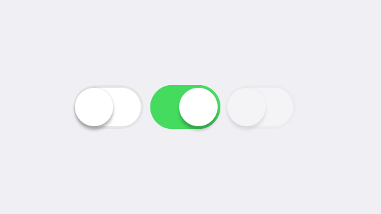
The preview of individual CSS Components is generated from the annotations embedded into the CSS. For example, the preview of the Switch component will look like:
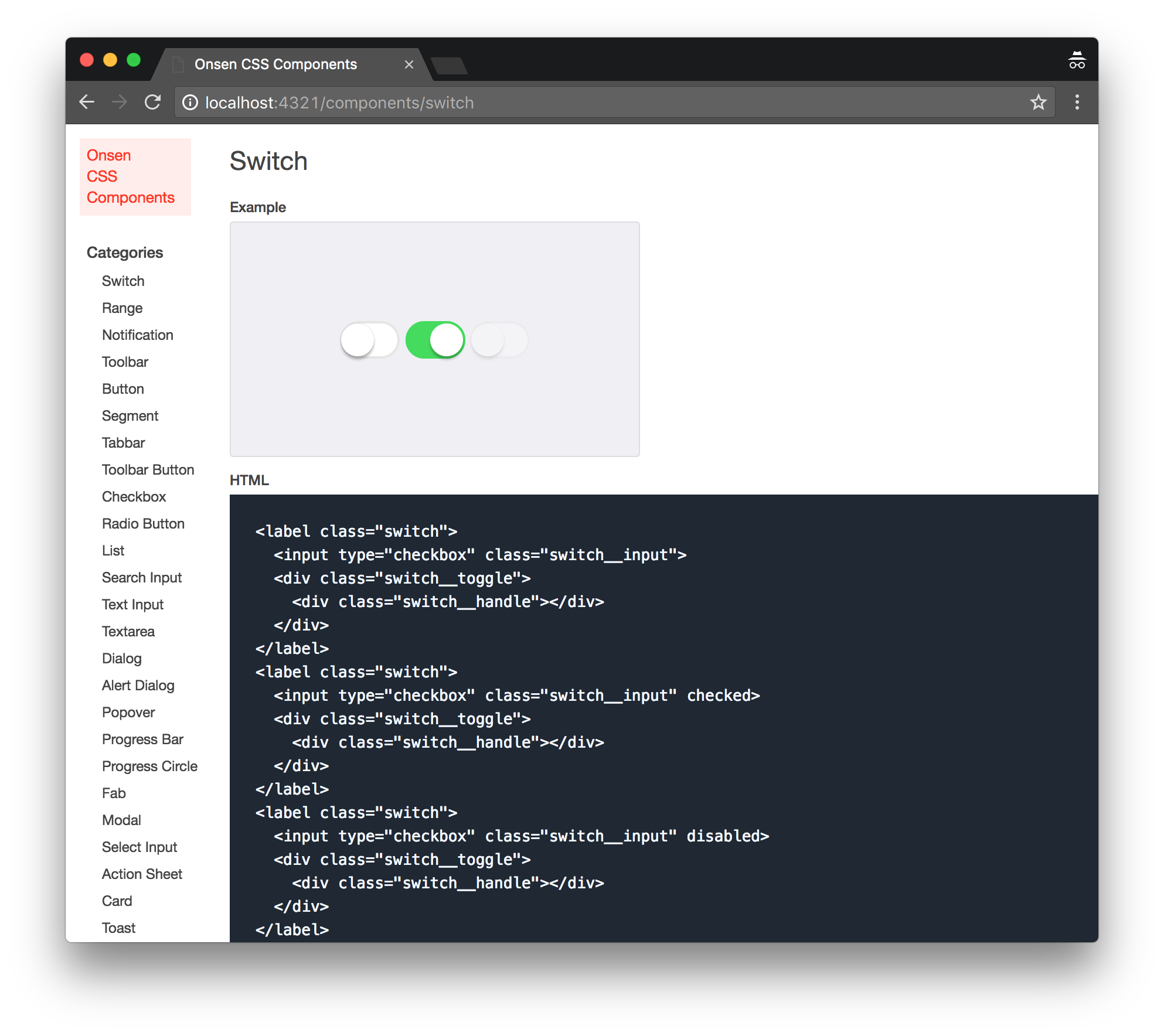
The HTML code used in this example is defined by the following annotation embedded in src/components/switch.css:
/*~
  name: Switch
  category: Switch
  elements: ons-switch
  markup: |
    <label class="switch">
      <input type="checkbox" class="switch__input">
      <div class="switch__toggle">
        <div class="switch__handle"></div>
      </div>
    </label>
    <label class="switch">
      <input type="checkbox" class="switch__input" checked>
      <div class="switch__toggle">
        <div class="switch__handle"></div>
      </div>
    </label>
    <label class="switch">
      <input type="checkbox" class="switch__input" disabled>
      <div class="switch__toggle">
        <div class="switch__handle"></div>
      </div>
    </label>
*/
Annotations are embedded in YAML within CSS comments. Actions like the modification of the HTML code, used in the preview to display the CSS Components, or the modification of the preview itself can be performed by simply modifying the related annotations or creating new ones.
If you are already running yarn run serve, annotation changes will be immediately reflected in the preview UI.
Pattern Customization
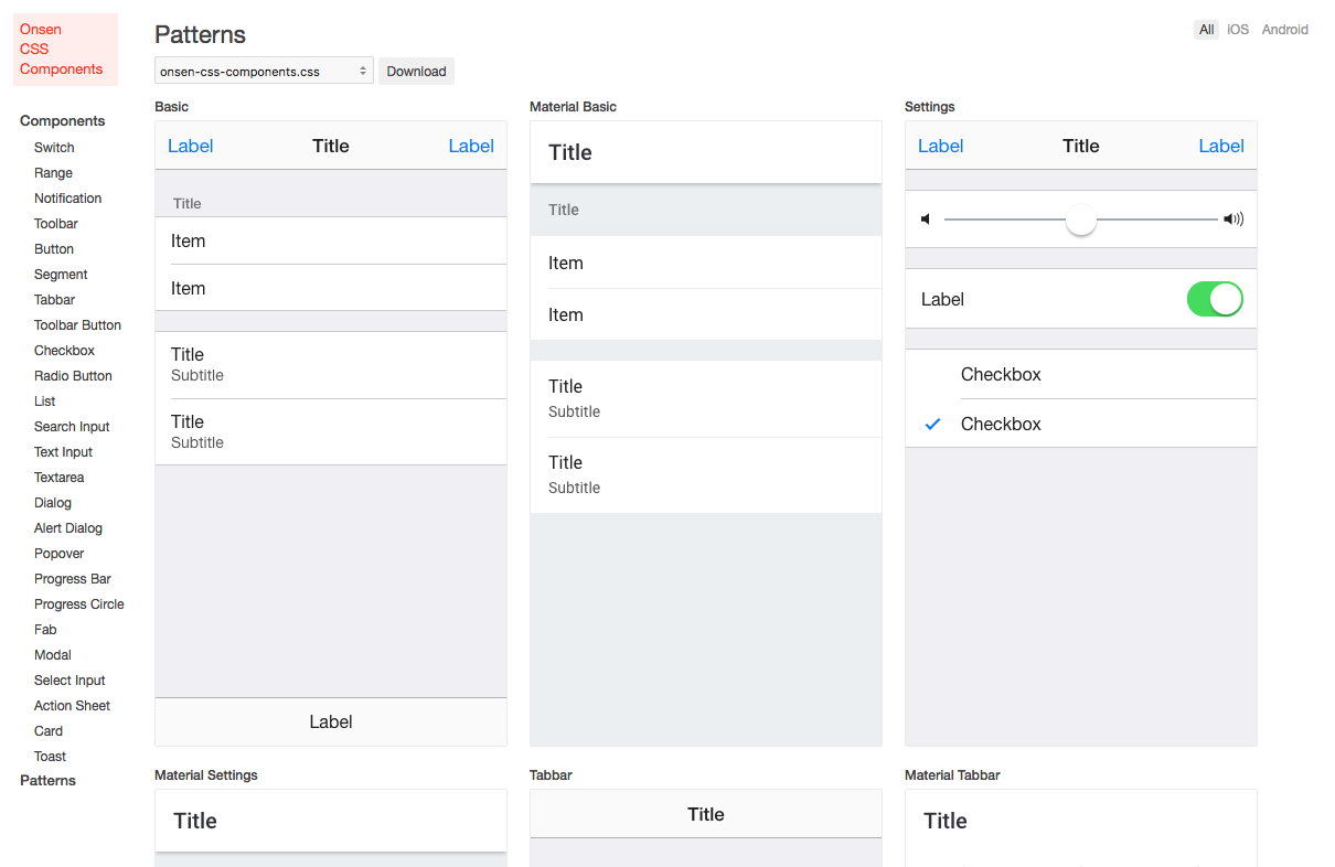
On the Patterns page, you can see multiple screens with a combination of CSS components. While customizing a theme, it is advised to perform the changes while constantly checking the result at this page. This section provides useful information to perform this kind of operation.
The HTML of the patterns is defined in css-components/patterns.yaml file.
---
name: Basic
markup: |
  <div class="page">
    <div class="toolbar">
      <div class="toolbar__left"><span class="toolbar-button">Label</span></div>
      <div class="toolbar__center">Title</div>
...
Feel free to edit patterns.yaml file content if you want to modify the content of the Patterns page. If the file is modified while the previewer is running, the changes will be automatically reflected on it.
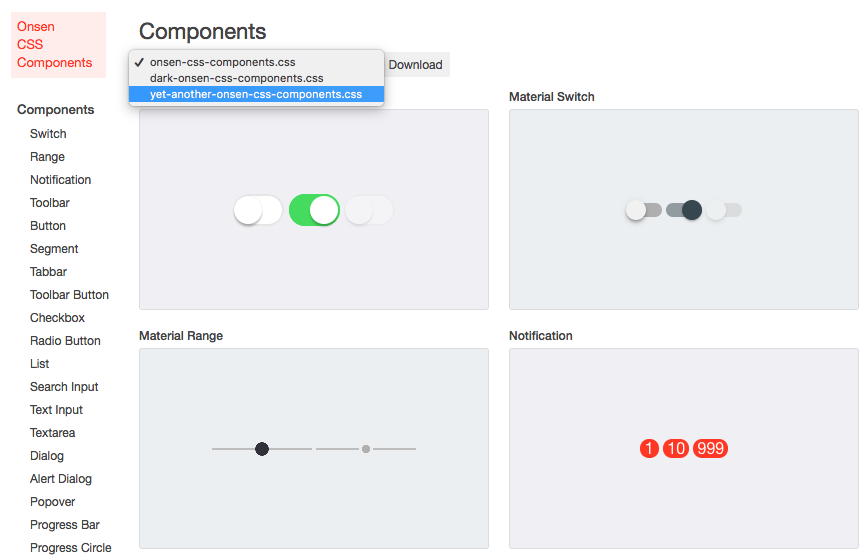
Add another theme
Instead of customizing Onsen UI default theme, you have the ability to add a different one.
Let’s try to add another theme, called yet-another. Create src/yet-another-onsen-css-components.css file, which will be one of the entry points for the build process, with the following content:
@import url('./license.css');
@import url('./yet-another-theme.css');
@import url('./components/index.css');
At this point, create a src/yet-another-theme.css file and paste into it the content of src/theme.css file.
Once you execute yarn run serve command and the build has been completed, you should see a message that informs about yet-another-onsen-css-components.css being successfully built into the build directory.
Built CSS Files:
  ./build/dark-onsen-css-components.css
  ./build/onsen-css-components.css
  ./build/yet-another-onsen-css-components.css
You will also be able to select the theme you just created in the preview screen.
Once you have verified that yet-another theme has been successfully built, you can proceed with its color customization by editing the CSS definitions in src/yet-another-theme.css file.
Modifiers
A modifier is a cross-component way to provide customizability for Onsen UI components in the shape of custom attributes. When a component is defined with a modifier, it will have a separate class namespace so that you can apply custom styles to the component. Some components have several easy-to-use preset modifiers to change the appearance.
For example, each of the following buttons has a different look. To change modifiers dynamically, please manipulate modifier attribute from JavaScript.
<ons-button modifier="quiet">Quiet</ons-button>
<ons-button modifier="light">Light</ons-button>
<ons-button modifier="large">Large</ons-button>
<ons-button modifier="cta">Call To Action</ons-button>
<ons-button modifier="material">Material Design</ons-button>
For further information, please have a look at this article.
Cross Platform Styling (Autostyling)
Onsen UI components are automatically styled depending on the platform where the app runs. You can easily test this feature with your browser Dev Tools by switching between iOS and Android views or by appending ?platform=android or ?platform=ios as a query string to the URL.
Automatic styling simply applies modifier="material" to the components when ons.platform.isAndroid() is true. You can disable this feature by running ons.disableAutoStyling() right after including onsenui.js (i.e. before the app is initialized). If you disable it you may need to manually specify modifier="material" in every component you want to display with Material Design. You can also specify disable-auto-styling attribute in specific components that you don’t want to auto style.
Some tools are provided to give a more accurate customization.
Platform utilities
ons.platform object is available with methods such as ons.platform.isIOS(), ons.platform.isWebView(), etc.
You can set a platform with ons.platform.select('android'), for example, in order to display Material Design on every platform. This must be called before the app is initialized (right after including onsenui.js).
Conditional element
A conditional element called ons-if is available to filter content depending on the platform or orientation.
<ons-if> component is not available for React and Vue bindings.
  <ons-if platform="android">
    This is Android
  </ons-if>
  <ons-if platform="ios other">
    This is NOT Android
  </ons-if>
With this, for example, you can display ons-fab for Material Design and other types of buttons for iOS flat design.
AngularJS 1 bindings also provide ons-if-platform for this purpose:
<div ons-if-platform="android">
  This is Android
</div>
Icons shortcut
ons-icon provides a shortcut to make auto styling easier:
<ons-icon icon="ion-navicon, material:md-menu" size="24px, material:20px"></ons-icon>
The second icon will be displayed when material modifier is present (other modifiers can be used).
Animations
Onsen UI already provides multiple built-in animations for its routing components and dialogs. However, it is also possible to create custom animations for specific components or even extend existing animations and change part of them. This is a relatively advanced topic since it requires digging a bit in Onsen UI core code.
Animit
Onsen UI relies on Animit, a minimal animation library for managing CSS transitions on mobile browsers.
Animit can be accessed with ons.animit or import { animit } from ons;, depending on the type of the app. It exposes methods to queue CSS animations, apply delays and run callbacks as follows:
let animation1 = animit(myElement) // This defines the animation for the provided element
  .saveStyle() // Saves the original style of the element
  .queue({ // Original position/style in the animation
    css: {
      transform: 'translate3D(0, 100%, 0)'
    },
    duration: 0
  })
  .wait(0.2) // Delay applied before the transition starts
  .queue({ // Next step in the animation
    css: {
      transform: 'translate3D(0, 0, 0)',
    },
    duration: 0.6,
    timing: 'linear'
  })
  .restoreStyle() // Restores the original style of the element
  .queue(done => { // Optional "On transition end" callback
    callback();
    done();
  }
);

animation1.play(); // Run the animation
Since Animit modifies the element’s style property, it provides saveStyle() and restoreStyle() methods to ensure the previous styles are not lost. queue({css: {...}, duration: 0, timing: 'linear'}) or queue({...}, {duration: 0, timing: 'linear'}) method is provided to add transitions to the queue. The first one will be the first style applied in the animation that will transition into the following styles. In the provided example, we are moving a new page inside the view from right to left. Therefore, it needs to start at position translate3d(0, 100%, 0) and move to translate3d(0, 0, 0). Method wait(...) can be used to apply a delay between transitions. Finally, we can optionally call queue(function(done) { ...; done(); }) again to run a callback if necessary.
It is also possible to pass an array of HTML elements to animit if performing the same animation on multiple elements is required: animit([el1, el2]).saveStyle()....
It is very common to have more than one animation running at the same time. animit.runAll(animation1, animation2, animation3); method can be used for this behavior instead of animation1.play(); animation2.play(); animation3.play();.
Creating animators
Animators can be created from scratch by extending the necessary animator classes that Onsen UI provides. Every component exposes a minimum animator interface that must be extended and implemented: NavigatorAnimator, AlertDialogAnimator, DialogAnimator, PopoverAnimator, ModalAnimator, TabbarAnimator and SplitterAnimator. This is the desired way to implement animators if you want to build a custom version of Onsen UI or want to make a pull request to the repository. For more information, please have a look at the existing animators for every component.
ES2015 (ES6) is preferred but not strictly required for this to work. An example in ES5 can be found here.
Extending animators
A way to make new animators is extending an existing animator and modifiying part of its behavior (or all). This is in general easier if you just want to tweak the appearance or timing, or even if you want to create a whole new thing starting from another animator. For this it is also required to have a look at the existing animators, choose one and check its properties and methods. Every animator provides a extend({...}) class method that returns a new animator. Animators are exposed in every component class: ons.elements.Navigator.animators or ons.elements.AlertDialog.animators are some examples. These objects contain all the registered animators and can be extended as follows.
var fadeIOS = ons.elements.Navigator.animators['fade-ios'];
var customAnimator = fadeIOS.extend({
  timing: 'cubic-bezier(.1, .7, .1, 1)',
  delay: 0.1,
  push: function(enterPage, leavePage, callback) {
    ons.animit.runAll(
      ons.animit(enterPage)...,
      ons.animit(leavePage)...
    );
  }
});

// This step is mandatory
ons.elements.Navigator.registerAnimator('customAnimationName', customAnimator);
This overwrites the push animation but uses the original pop animation. timing and delay properties will still affect both animations. Some animators have extra properties, such as backgroundMask. Please check the animator you want to extend to see all the properties.
After the new animator is created and registered, we can simply specify the animation with its name: myNavigator.pushPage('page.html', {animation: 'customAnimationName'}). Or make it default: <ons-navigator animation="customAnimationName">. The same applies to the other components.